Summary

Project Goals

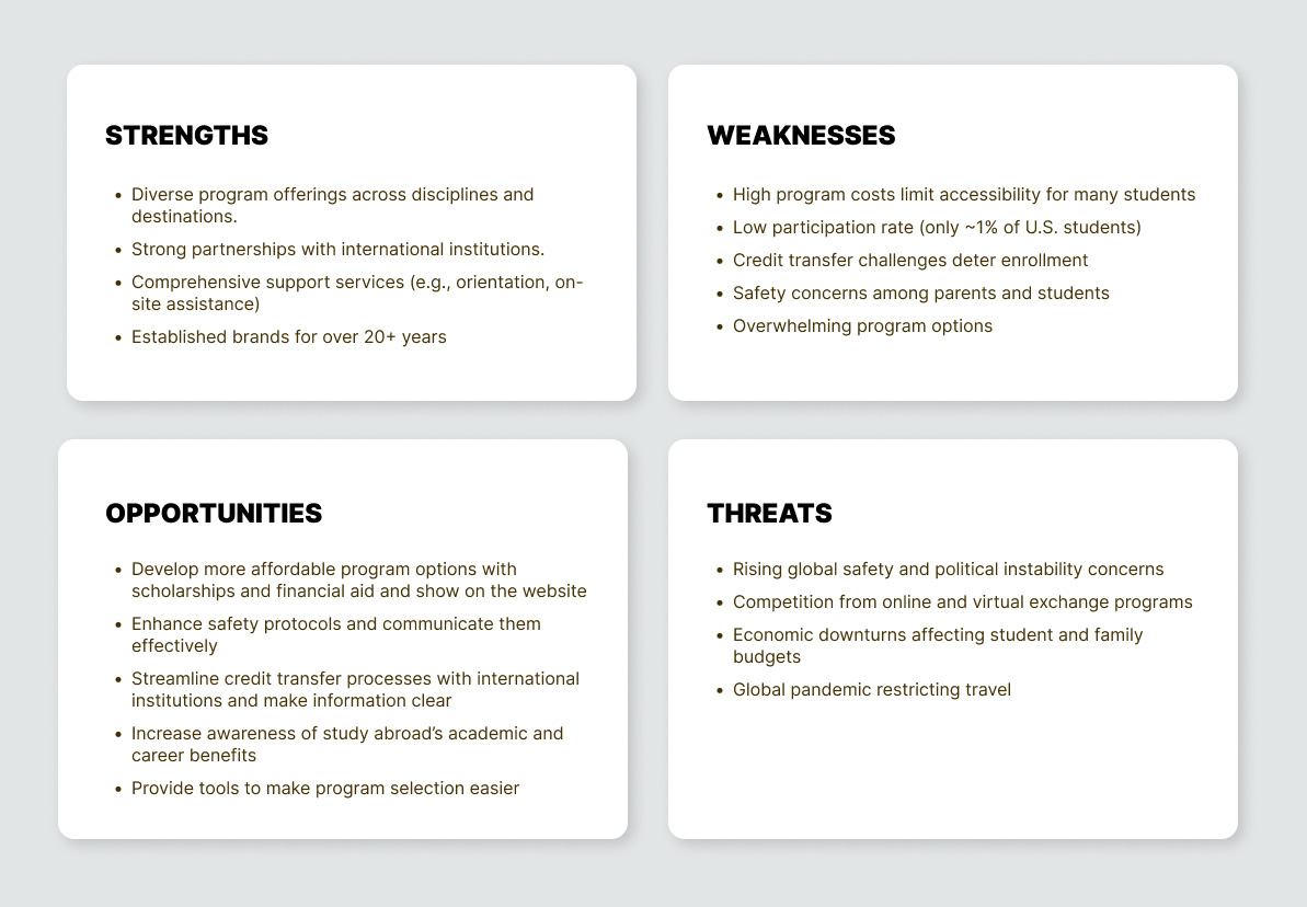
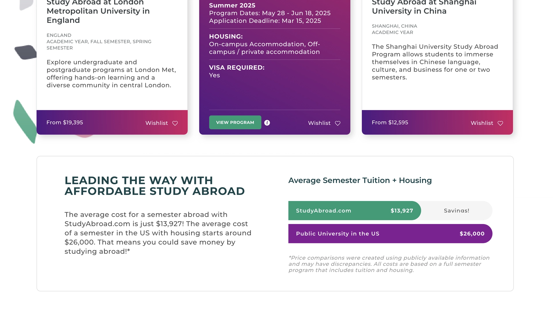
StudyAbroad.com was founded to offer affordable study abroad programs in unique destinations, setting itself apart from long-established competitors that have become overly corporate and disconnected from student needs. To succeed in a saturated market, we conducted in-depth user and market research to uncover key pain points – complex admissions, hidden fees, and lack of transparency.

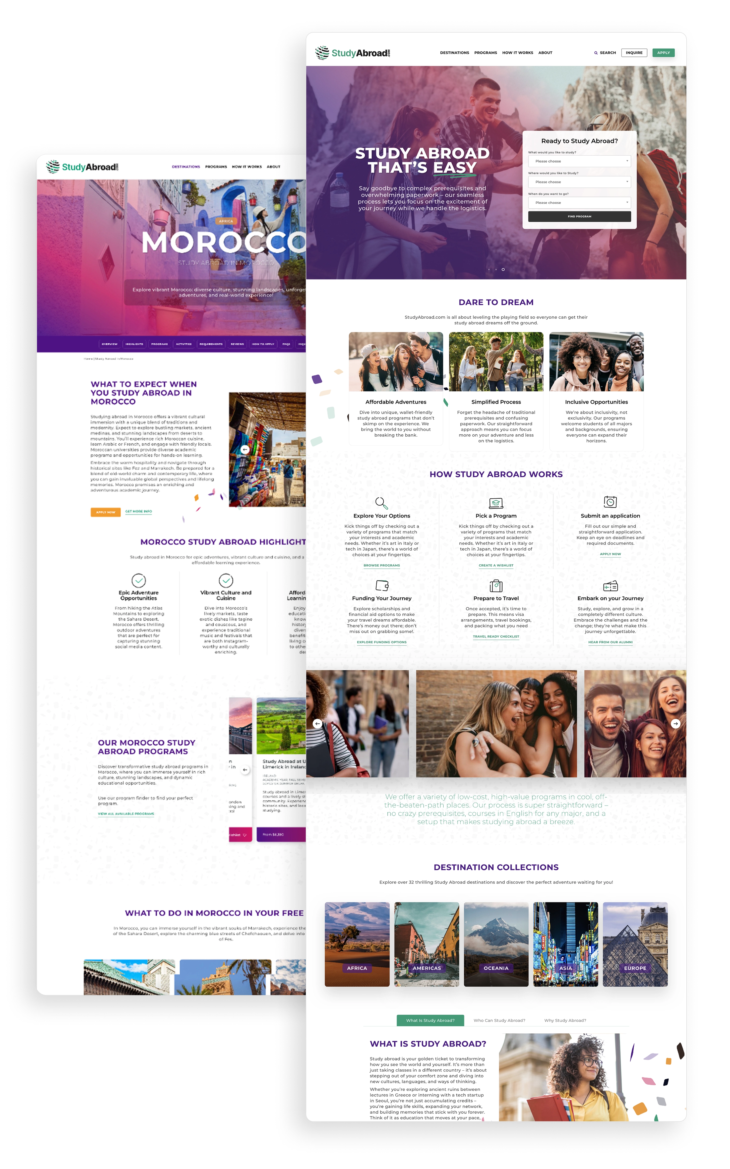
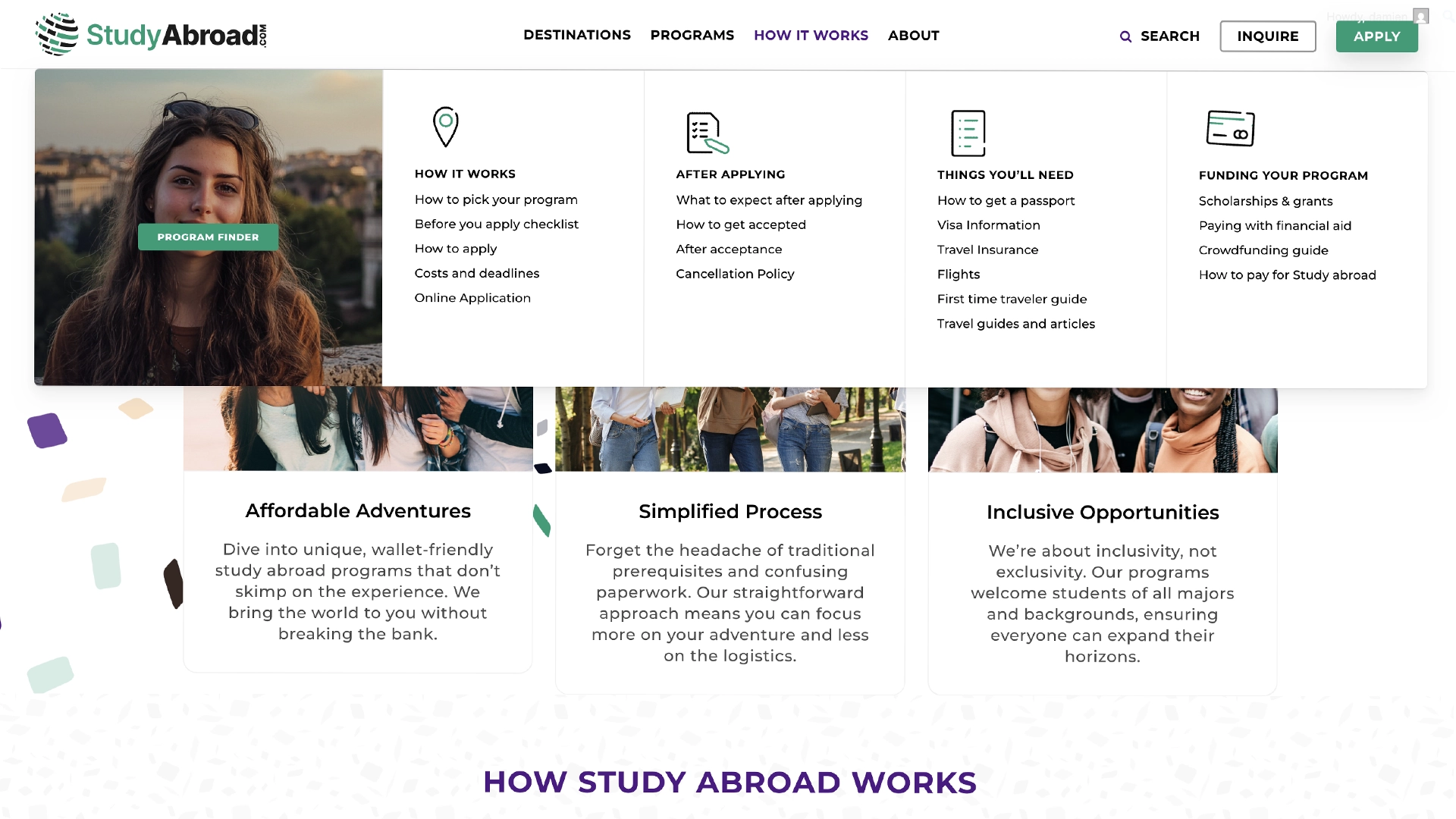
These insights shaped our strategy, ensuring a seamless, student-centric experience. From brand identity to platform design, we simplified the inquiry and application process, reducing friction and improving accessibility. By leveraging a modern digital framework, I created an intuitive, cost-effective alternative to legacy providers, making international education more attainable.

My contributions

I was the only product designer on this project and was responsible for project planning, UX/UI designs and prototyping and then building the site within a wordpress environment whilst liaising with all internal marketing staff and key stakeholders.

BACK TO CASE STUDIES
CLIENT
INDUSTRY
PROJECT SCOPE
• Strategy & roadmapping
• Prototyping
• Website development
• Branding
PROJECT LENGTH
MY ROLE

Understanding and defining project approach

Understanding and defining the project approach from the start ensures clear goals, alignment, and a structured path to creating effective, user-focused designs.

Identifying opportunities by defining the market

We gathered insights about user needs, pain points, or behaviors through conducting interviews and surveys across 3 different demographics (Students, Faculty and Parents).

Our goals were to identify “demographics and interests”, “Needs & Concerns”, and “Brand Insights” for each.

From this data we developed 3 distinct avatars along with empathy mapping to better understand the needs and concerns of each before we started defining the problems that needed addressing.

Massive potential and opportunities

The study abroad sector in the United States is experiencing significant growth, with the market size valued at approximately USD 16,882.77 billion in 2023 and projected to reach USD 27,200.13 billion by 2031, growing at a CAGR of 7.36% during the forecast period.

Top Destinations for U.S. Study Abroad Students

  • United Kingdom (11.8%)
  • Italy (11.6%)
  • Spain (10.6%)
  • France (5.9%)
  • Germany (3.4%)
  • (Source: Open Doors, IIE)

Impact of Study Abroad

  • 97% of study abroad alumni say it improved their cultural understanding.
  • 84% say it helped them develop valuable job skills.
  • 41% of employers consider study abroad experience when hiring.

Key Challenges

The challenges are primarily how to create cut-through with a saturated market and address customer needs directly with on-site features and functions.

Design System

A design system is essential for a cohesive brand and digital product, ensuring consistency, efficiency, and scalability. It standardizes elements like typography and interactions, strengthening identity and user experience.

For StudyAbroad.com, I established the foundational design system, enabling global modules to be centrally managed and used across the site.

Prototyping

Low-fidelity wireframes outlined core functionality and hierarchy for key page templates. An agile, iterative approach ensured flexibility throughout development.

One of the biggest challenges for the program page was how to deliver alot of key information in a compact and non overwhelming way.

Including a link to the program search on every menu dropdown
Chat function that links to an AI chatbot and a human operator
Search function that links directly to the program search page
An entire menu dedicated to helping the user through the process end-to-end
User specific content
Wishlist functionlity to allow faster shortlisting of programs
Guided search function to get the user directly to the programs that are fit for them
Sticky secondary nav that allows quick anchor linking to deep content
At a glance section that allows quick absorbtion of key information and then wishlisting to aid quick shortlisting of programs

Global modular components creating economies of scale.

I designed reusable global elements to ensure consistency, scalability, and efficiency across the website. This modular approach streamlined development, reduced redundancies, and enabled seamless updates, achieving economies of scale while maintaining a high-quality user experience.

Minimizing choice paralysis with strategic content hierarchy choices and subtle features

Survey data showed choice paralysis and information overload, so I optimized content layout and key functions on sales pages to streamline decision-making.

  • Clear CTA’s, both fixed, and also at key points on the product page
  • Wishlist function
  • Key info at a glance section for the “skimmer” visitor types
  • Affordability USP’s

Solution

A modern website which focuses on the 3 main types of visitors needs, providing them features and functions to help make their selection and information acquisition process easier. This creates less friction and increased leads and conversions.

Features

Various features added to the website to support increases in leads and conversions on major product and landing pages.

Impact

Internal marketing and content teams are still populating the website page templates with content before launching the website, so full impact cant be measured yet. Overarching goals are below.

INCREASED LEADS AND CONVERSIONS

By reducing choice paralysis through features that help the student shortlist their favourite programs, not only can be gain data on most popular programs, but we can also increase the likelihood of an initial enquiry.

REDUCED CONTENT MANAGEMENT STRESS

Deploying an internal page builder with strong CMS, allows for easier internal content management. Major page templates are all all editable and the majority of commonly used elements on-page are defined as global elements and editable from one place.

FOCUS ON MOBILE FIRST APPROACH

The majority of the user-base are mobile first, especially for their research phases. As such, the website was designed with this in mind with useful features such as the at a glance sections and secondary nav scroll for deep content pages.